29 Jan 2009

Storyboard

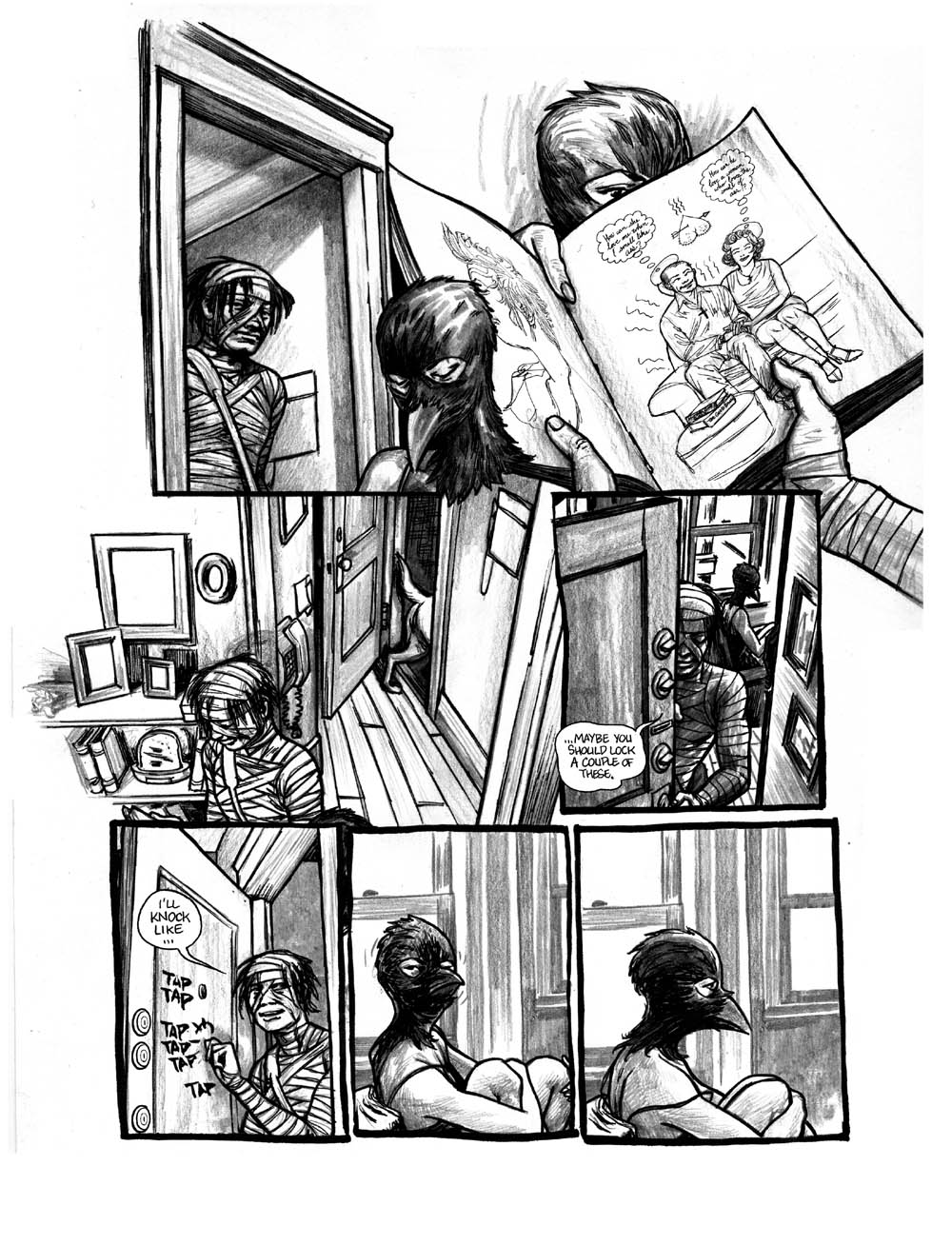
Here are the images from my storyboard. Not brilliant quality pictures of them.


There are another two frames on another sheet, showing the door on its own, and the last frame of someone hung above the door frame. Blood Dripping.

Test Footage

A few posts ago, I tried out turning a still image into a Rock'n'Rolla style image. It worked quite well, and I was pleased with the outcome. I also said that I was going to try and test out the effect that I was thinking of doing with some live footage. Here it is:


To create this I have taken two short clips from youtube. For the first clip I made a freeze frame of the last frame, and used photoshop to turn it into the comic style image that I wanted. I then did this with the first and last frames of the second clip (although its very short). After that I put all three images along with the two video clips into after effects, and then animated the different layers to rotate and turn into eachother. Creating the Transition that I was after.

I am fairly proud of this, although I know there are many mistakes, and most of them just stupid mistakes, I think that this is a good oppertunity for me to practice some more, maybe when I get home and charge my camera a bit I can try again with some of my own footage.

28 Jan 2009

Shot List

Here is a breif shot list that I will be using to create my first rough storyboard.

Zoomed in mid shot of curb, tracking forwards.
- Text flies in on curb, then out once read
- Car drives past, at speed, splashing a puddle over the path
- Sound of rain, maybe faint music all the time over this shot

Various shot of car driving into carpark
- Some tracking shots
- Some long shots

Mid/Long shot of car pulling up in the car park.
- guy (Detective/Antagonist) gets out of the car
- maybe dialogue
- Move to close up of face and top of car
- Turns into image for transition
- Actor's Name comes up across the top of the car, somewhere that works well.

Rock'n'Rolla style transition
- Moves from the last frame of the guy's face and car to first frame from next shot
- All done in after effects (Finnish test footage)

|----------
|
|
|
|
| Undecided shots, but will include things like mid shots, and close ups, also with some smooth | tracking shots.
|
|
|
|
|----------

Long shot of Detective walking towards a crime scene/building.
- Police tape around the area
- cuts to a close up when he gets there, to see shock/horror on his face.

end.

Storyboard + Concept Ideas

So far this week I have been focussing on planning out my storyboard. I have had a few attempts at creating some short storyboards that are not related to my project, but are good practice for creating a storyboard.

To start off with creating a storyboard, I created a 9 keyframe storyboard, which shows 9 key frames from my sequence, much like the images seem on www.artofthetitle.com. This was good because it gave me a chance to really think about what I am going to put into my sequence.

Another thing that I have done is to create a 3 clip storyboard, where I have chosen 3 key frames from my sequence, and drawn them out in much more detail. In the Below post you can see the image that I drew for this task.

Storyboard Test

Here are three images that I have created as a kind of test go at creating a storyboard. And I will soon be able to create my full storyboard.


24 Jan 2009

Images for Mood Board

Next week I will be creating a mood board for my project. Before hand I am going to collect a set of images that I can use for inspiration. Here is a long list of images that I could use:


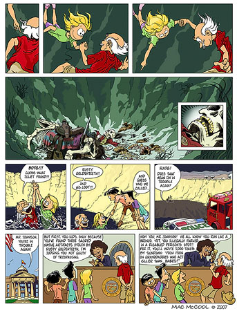
I know that a few of these go off the page, but I can talk about them none the less. From these images I can see that allot of graphic novels use either very vibrant colours or very dull colours, either sepia tone or a lower saturation effect. I think that I can easily acieve the latter effect, and that is what I was going for originally, the other might be a little harder, but I am not going for that effect anyway, so it doesn't really matter too much. Perhaps I will look at doing something like that at a later date, when my project brief fits that effect.

The following image I found very interesting indeed. Because this is a graphic novel that came up under a search for "Crime Graphic Novel" it is an extract from the Max Payne 2 graphic novel. This is especially helpful for me because I am doing something along those lines.


From this I can see that another Detective Graphic Novel has been done showing the detective as a dark character, the lighting is very dark/dim, and I can see that there are few other characters. This is exactly the type of style I was going for, and the shots shown here are easy enough to re-create. Hopefully these images will help me with my moodboard next week.

Possible Fonts

I have had a look at some title sequences, and while on the most part they use very bland fonts, but some of them have used more interesting fonts, and I was thinking that I could possibly use some different fonts for my Opening Sequence. Making sure that they fit with the genre and film, I can now look for some different fonts than the standard ones found on my laptop.

--------------
20 minutes later
--------------


Now that I have looked at some fonts on www.dafont.com and have picked out a few to consider using for my sequence.

I thought about what might work for my sequence, and I thought that I will need something to suit my genre and film. And I thought that for a graphic novel you would usually use something big and in-your-face; so I had a look on dafont and found a few, looking under the catagories :

Fancy - Eroded
Fancy - Distorted
Fancy - Curly

I found a few that I really liked and have put them on this simple Photoshop image:


I have also made sure that these fonts are free to use, so I can't get caught up in some copyright deal with the owner of the fonts.

The ones that I have selected would all fit under the catagory "Graphic Novel" and so would fit in with my film. At the moment I am not completely sure which one i should use, if not more than one. I was thinking perhaps I could use a different font for each of the characters, so when I introduce them, I can use a font that fits the character, even though I will be introducing the names of the actors not the characters.


List of the Font Names (Not in order shown)

Aftershock Debris
Ank
Beyond Wonderland
Broken Ghost
Chicago House
Docteur Atomic
Hard Rock
Steak
Vtks

Essential Elements of an Opening Sequence

Here is a short list of some essential elements that need to be considered when creating a good opening sequence to a film.

1: Title - The title needs to be memorable, nothing over the top, but nothing too simple and easily laughed off ("Snakes on a plane"). Something short, but clever, perhaps a play on words, something that people are likely to remember when thinking about the film. After you have the title decided, you need to think about where to put it in the sequence, do you put it right at the end? Or right at the beginning? The answer is - Neither. Most film openings that work have the title of the film about half way through the sequence. Usually introducing the Production companies that worked on the film first, title, then the actors that play in the film. When thinking about placing it in the sequence, don't just place it in anywhere, make sure that the action that is happening at the time can be paused for a few moments so that the audience can read the name of the film. But does not take too long or disrupt the flow of the sequence.

2: Audio + Sound Effects - The whole soundtrack to the sequence also needs to make sure that it sets the mood for the rest of the film. Does it have a Narrative introducing everyone & the story, or does it stick to just music? It really depends on the film that is to come, sometimes a narrative introduction fits in well, such as in Lock Stock (analysed below) and some other times a pure music soundtrack works like Terminator 2 (Also analysed below). The soundtrack in the first few minutes needs to be very careful, because if the rest of the film is made, the soundtrack from the beginning can be very thought provoking, if it is fast paced at the start, but the rest of the film is very slow, the wrong impression has been given out by the audio at the start. Also it needs to be able to relate to the action in the scene. If there is a slow dance going on in the scene, the last thing you want is some heavy/death metal playing over the top, it just doesn't fit. These are all things that I will need to consider when creating the soundtrack to my opening sequence.

3:
Camera work - Camera work in this can be very important, depending on what sort of camera work is used for the opening sequence, determines the style of camera work for the rest of the film. Lots of interesting angles and clever tracks can always lead the audience to believe that the camera work is going to be like this for the whole film, and yet if the camera work then stops being interesting and just becomes a bunch of static shots, the audience is going to get very bored very easily. I think one film that has used the camera shots amazingly is "Never Back down", throughout the entire film very clever and interesting camera shots were used. Below is a clip from the film showing the camera work that I like.


I especially like the camerawork in the short clip between 5:30 and 6:30, and I think that camerawork like that if used once, needs to be used throughout the film, and this is one of the few films that I have seen that has succesfully pulled it off. I think that I might attempt at using clever and interesting camerawork, but will have to see when it gets to filming.

4: Costume -The costume that the characters are wearing is a largely important thing to consider when filming this. Make sure not to use a high class suit with trainers, unless that was the sort of look that you were going for, in which case its always a good idea to explain that in detail in the actual footage, so the audience can understand why there is a character dressed in a suit and cheap trainers. Another thing that is essential to be aware of is the fact that what a character is dressed in can give out the wrong assumptions to the audience about what sort of character he/she is. Make sure to dress them in something that is suitable to the charater that they are playing and not in the first thing that comes to mind when thinking of a certain genre. Costume can also set a scene up, if the character is at a high class meeting with the president of the united states, wearing what the actor/actress wore to an illegal rave the night before, covered in mud and with glow sticks hanging around their neck, the audience is going to think that something is up. Make sure that the costume fits in with the rest of the setting.

5: Visual Effects - Visual effects are as much a part at setting the film up for the audience awaiting the rest of the film as any of the above. But it plays a such a large part because its not only selling the genre of the film to the audience, but it is also selling the techinal expertise of the film. By showing both what is going to happen in a film to sell its genre (Explosions - possible action... Lots of Blood - Possible Horror) and the level of detail put into the visual effects, showing the audience the level of special effects that are to come in the rest of the film. Poor low budget (swede) special effects, like cardboard guns and stop motion muzzle flare, are going to give the audience a sense the film was on a low budget and mostly invested in solving the more immediate problems such as camera, acting and setting. Whereas an opening with lots of flashy high tech explosions and flashy guns:


Here in a trailer for "The Dark Knight" you can easily see that allot of time and effort has gone into the special effects. The explosion at 0:39 is a prime case of this. And this is a movie that brought millions of viewers to watch it, sometimes more than once. The Visual effects are a large part of any film these days, with technology and techniques changing every day, there is always big competition in the big special effects companies to see who can come up with the most awe-inspiring visual effects to date. They can Make a film, just like they can break a film, so I will have to pay allot of attention when thinking about special effects.


-------

Aslong as I try my hardest to keep everything in mind when creating my Film Opening, I am sure that I should come out with something that is good, and meets all the criteria, while also entertaining me and my peers.

20 Jan 2009

Test Image

I today found an image on Flickr that is not liscenced, and free to use, in order to test out the idea that I had for the title credits when introducing the actors. In the Style of the Rock'n'Rolla poster.

I have had a quick play about in photoshop, and have come up with a simple image that I will then use as a base point for my credits.


To achieve this effect I have turned the image into grey scale by de-saturating it. Then I altered the levels slightly to make the lighter parts of the image more visable, and then applied a gradient mixer so the two colours are the only ones shown. Then I applied a Cutout filter and created a simple background with a few custom "Splatter" brushes. After applying the text and some effects to that, I was done. A simple but effective process.

I think that I will need to have a test go at using the same effect with a clip of my own, and also animating the image at the end of the clip. To complete the process. I'm looking forward to having a go at that. Which I will probably do soon, either later this week or next.

19 Jan 2009

CDFilms Production Logo

In tandem with the Long Road Production Logo I have created previously, I have also created a personal Production Logo, something that I can use myself when creating films of my own.

Its a simple after effects video, and using the particular plugin, I have created an effect of particles flowing across the screen, by moving the particle generator across the screen and bringing the text forward, I have managed to be able to create a simple but effective clip. Here is is:


Credits Style Idea

I have been thinking about the feedback that I got from my classmates today, and I think that I am going to go with the first idea, a sin city style detective action story based on a graphic novel.


I have been also thinking about how I will put it all together. I was thinking of putting a few short clips into the scene, then using the last frame and turning it into something along the lines of :

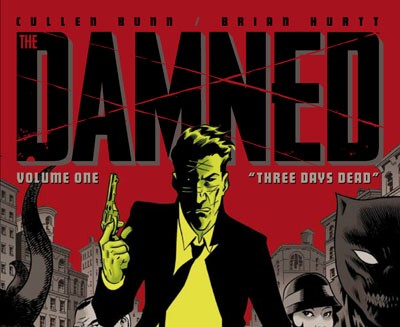
(although this is a soundtrack cover design, it is in the same style that I am thinking of)

Using photoshop on the images, I will turn them into images of the same style as above, using vibrant colours, and using more than one layer then animating them slightly in after effects. Having the actors name overlaying the image somehow.

I am sure that I will have a go at this soon, and then see how well it turns out with some test footage.

Film Opening Comparison Essay

Terminator 2 Title Credits:

Arnold Schwarzenegger
Terminator 2 - Judgement Day
Linda Hamilton
Robert Patrick
Joe Morton
Earl Boen
S.Epatha Merkerson
Danny cooksey
Castulo Guerra
and introducing - Edward Furlong
casting by - Mali Finn
Constumes Designed by - Marlene Stewart
Music by - Brad Fiedel
Industrial Light and Magic Visual Effects SuperVision - Dennis Muren, A.s.c.
Special Makeup and Terminator Effects produced by - Stan Winston
Film editors - Conrad Buff - Mark Golblat A.C.E - Richard A. Harris
Production Designer - Joseph Nemec, III
Director of Photography - Adam Greenberg, A.s.c.
co-Produced by - B.J.Rack - Stephanie Austin
Executive Producers - Gale Anne Hurd and Marid Kassar
Written by - James Cameron & William Wisher
Produced and Directed by - James Cameron

Lock, Stock and Two smoking barrels Title Credits:

Summit Entertainment
the steve tisch company
ska films
presents
a matthew vaughn production
a guy ritchie film
Lock, Stock and two smoking barrels

Comparison:

The two Opening sequences are very different to each other, Where the "Terminator" Sequence is very simple, but uses lots of effects, the "Lock Stock" Sequence is much more action based. Terminator has used the footage that they have of a playground on fire, which in itself is a very strong image to think about, and have just overlayed their titles ontop, In a simple white text. So to say that the viewer can either keep an eye on the fire or read the credits if they are interested. The footage that they have used is interesting enough that having quick breaks to use white text on a black background, like in "Lock Stock", would not work. It would not flow with the footage and would not appeal to the audience, probably already gripped to the fires.

Lock Stock on the other hand, while no where near as dramatic, uses the White text on Black background idea. and while very different to the terminator sequence, it works with the footage that they have. Keeping the voice of the actors in scene going while the credits of the production company are shown, makes sure that they audience knows that what they were just watching is still happening and they are not going to have missed anything when the video comes back. In this sequence it works really well, and definatly fits in with the footage that the film makers had.

Another thing that I have noticed that separates the two from each other is that the Terminator one shows the names of a fair amount of the actors, and many more of the production crew. Whereas the Lock Stock one only shows the production companies involved and the directors name. Although I am not 100% sure of the causes, I can suggest that the differing credits are more to do with the actual footage than anything else. The Terminator sequence had allot more space in which to put the credits, with a constantly flowing clip, the credits could be placed in a large number of places, and with enough time to fit them all in, there was no problem in making it look rushed. This is helped by the fact that the actual footage is very slow paced to begin with, and gives the illusion that everything is slower than it actually is. Something very different applies to the Lock Stock sequence, in this one it is a very fast paced action sequence, and putting the titles on the video would not have sufficed enough time for the audience to read them, the camera work and shots are not cut long enough to be able to place a credit on there that is easily readable with the time alloted.

On the whole I think that these are both great examples of opening credits, where one is more to set the scene, and introduce the actors, the other is there to start the audience off with a bit of storyline. Maybe I could learn allot from looking at these, and using some of their techniques.


Feedback on Pitches 3 & 4

And after pitching my 3rd and 4th ideas to the same group, this is their feedback to me:

Pitch 3 Feedback:

Most people thought my idea was interesting but bland. Perhaps if I had thought about it a bit more, I could have had a better pitch and a more interesting film.

Pitch 4 Feedback:

On the Whole for my last pitch, everyone though that it would be a believable film and very interesting to watch, perhaps an overused subject but might work well as a realistic film.

Pitches 3 & 4

After Receiving Feedback on my first two ideas, I thought I might add a few more pitches to my bank, So I thought up an idea for both of the remaining briefs quickly, and then will ask for feedback to them.

Brief 3: An independent movie featuring a young protagonist
Your film should appear to be financed through regional funding


For this one I was thinking about doing something along the lines of a small group of student males go out for a camping trip, their tent blows away, and they loose everything in the winds. The Film is about their struggle back to society, adding some comedy along the way, keeping spirits high.


Brief 4: An animated feature to appeal to adult audiences
Your film should appear to be based on a "fictional" novel


For this one, after watching A Scanner Darkly, I really like the idea of a group of young adults all hooked on drugs, the film would be about the group, one of which is a 'bent' cop, who doesn't arrest the group for all the drugs because he does the drugs aswell, The film would also include a group of police officers, who are investigating the group. It would build up to a big bust, and the cop being thrown in jail, ending in tragedy, but perhaps with allot of action and/or comedy on the way.

Feedback on Pitches 1 & 2

I have pitched my Two ideas to the class, and received some feedback:

For the First Pitch:

On average everyone thought it was a good opening to a film. Very Dark and some of the people I pitched to would be interested in watching it as a whole film.

Second Pitch:

People thought that it has allot of potential, and could turn out to be a very interesting film to make, and watch as a whole film, sort of along the lines of "The Descent", Interesting and has potential for allot of twists to be added in.

18 Jan 2009

Film Pitch 2

Film Brief 2: A supernatural thriller that will appeal to female audiences. Your film should appear to be an international co-production.

For this Brief I was thinking about going with a very 'Disney' or 'Twilight' type of film, its aimed at a young female audience, based around fairys and wizards, it could easily be recognised as a supernatural film. To add the Thriller part into it, I was thinking about, instead of doing the basic and most common thing that people do when thinking of Thrillers, and adding in lots of blood and guns etc. But instead going on more of a "Save the Princess from the Dragon" idea. I know I'm going out on a limb here, but I think that perhaps adding the right amount of tension to certain situations in the film, I could make this easily seem like a thriller for a younger audience.

Here is my idea:

A young group of Female characters, Fairies, are stubling through a forest one rainy day, when they all get split up, and are forced to go out into the forest alone in search of rescue or each other. The film is about the group of them trying to find each other. They all have a different storyline to their journey, some of them might meet up, some of them may end up alone. By the end of the film one of them dies, and the rest get together again.

I think that this would be a good idea, and perhaps easier to pull off that the last one, but no where near as interesting to make. In order to make this seem like more of an ' International co-production' I will add foreign names to the titles. Simple enough to pull off.

Film Pitch 1

Having now being given my brief for the project I now need to come up with several ideas to use for my project. Here is a short pitch for the first brief...

Film Brief 1: A mainstream action film that will appeal to 15-25yr old males. Your film should appear to be based on a "fictional" comic book.

I was thinking perhaps to do a more believeable comic book idea for this one, instead of superman or spiderman, but more along the lines of Sin City, where although based on a comic book it does not include a large amount of unbelieveable stunts and special effects to achieve the main characters superhuman abilities.

Maybe something like this would do the job:


Here is the Sin City Opening Sequence, this uses a small amount of effort to achieve an eyecatching and memorable title sequence. It uses the very simple sort of White on Black text effect for the titles, but jazzes it all up by using comic style images for the background and a more interesting font for the text, And using overlay effects it makes the text semi-transparent and again, more interesting to watch. I also really like the fact that this title sequence, while using the images and introducing the actors, nothing is ever static. things are always moving all over the place. Giving the film to come a very active feel to it, making sure the audience is not going to get bored by telling them early on that the film is not a go-slow, but will have allot of action in it.


So, I would like to create a film intro that is based on a graphic novel, much like Sin City, but aound a cop, much like 'fingerling' in the film "The Number 23". He is a very dark character, allot of mystery surrounds his past, and is a very quiet man while working. The Opening sequence would end with the very start of the big mystery for the whole film, keeping the viewers gripped.


16 Jan 2009

Long Road Production Logo

I have created this short clip where I have animated the Long Road Logo in After Effects and added a camera to simulate motion. Simple things, just moving it in 3D space. I will use this for all my videos that I create in college. Along with my own one that I will create soon.

Video -

Other Students work Thoughts

Having Looked at T2-61, I think that I can tell allot of things about how to do my own project. I think that some of the strengths that the research and planning had were that they did allot, and used a fair amount of visuals, but were lacking in certain areas. The construction of their video was done well, I think that the content was poor, and it certainly had a student made feel to it. But some of the effects that they used were very good, and worked well in the context that they were used.


This video from Hurtwood House, was very good, in terms of a short sequence, and special effects, it was done very well, unfortunatly, it lacked any form of story line that the audience to grab onto and use to understand the sequence. I found it interesting because of the special effects mostly, and the setting. All because of personal taste though. I also think that the camera work was done brilliantly, not too over the top, but not too bland, a mixture of moving shots and static shots really brought the film together.

13 Jan 2009

Universal pictures Production Logo


The logo here, and the introduction that Paramount has to any film, is fairly simple, using a few images, such as the mountain that you can clearly see, and the stars that have been repeated and then animated along a circular path, around the mountain. Other than that, the effects used are simple and just things like text re-scaleing, and path animation. Which when put together create this very simple, but memorable production logo.

Warner Bros

Warner Bros is the company that created I am legend, the film that I used in my last post. They have done many many more films and are one of the biggest names in the film industry.

Other films that they have created include:

10,000 BC
Yes Man
One Missed Call

(Full list here: http://www.imdb.com/company/co0023293/)

From this I can tell that Warner Bros are a company that create a large amount of the big films, and are also very good at advertising their new films. In the opening for I am Legend, there are no names in the sequence, but instead it is mostly just action.

12 Jan 2009

Continuity Task


Not a very good example of Continuity, and so I think I should have another go at this, to make sure that I can grasp the concept and execute it thoroughly and effectively.

I am legend Opening Sequence

http://uk.youtube.com/watch?v=EgxgofbO0NA&feature=related
http://uk.youtube.com/watch?v=nyNu0CDim0w&feature=related

The sequence starts off with some slow moving/static shots of a run-down manhattan, before moving into a high speed car scene, where the main character (Robert Neville) is driving him and his dog around, and is speeding through the completely deserted city.

He comes across a herd of deer, he instantly picks up his rifle and aims at the deer, the way that he does this gives the audience that this is not the first time he has tried to shoot the deer, showing some sort of history to the film, that is, although not explained there and then, is not explained later on in the film.

As the deer then run into a tunnel, which is dark and ominous, the character and his dog avoid the darkness with a sense of fear put across their faces, perhaps this film has a plot line where the characters are afraid of going into the dark.

At the end of the sequence, Robert is walking around an old run down cinema, where he spots his prey, and goes in for the kill. As he is thinking of shooting the deer, a Lioness jumps out from off shot, and kills the deer herself. Robert instantly puts his gun up to defend himself, but looks at the lion with an understanding in his eyes. A male lion, and two cubs then come out from the same direction that the Lioness came from, walking in casually, to inspect the kill.

The effects that are used here are minimal, obviously a large portion of the city has been altered to add the effect that the entire city is deserted, other than that the editing is simple, some quick cuts, and some slower cuts. Overall the editing is used in a way that fits with the action that is happening in the scene. At the beginning where there is nothing going on, the cuts are slow, moving from one to another to show the empty city, and at the end where the scene has allot going on, the cuts are allot quicker, respectfully for the action and drama.


(Analysis of both videos together as a sequence, could not find a full clip)
(Also, embedding was disabled)

8 Jan 2009

Practice footage

Short clip, of a made up introduction to a made up film.

I used very few specialist effects in this clip. A few cross fades, and some keyframe animation for the text and two clips of video. Other than that, this is a very simple video to produce. Should I have had more time, and better software, (after effects), I could have done something more interesting. But for now this is what I had to do, And so is what I did.